Small Caps — History, Typography Rules, and How to Use Them Online
Small caps are the quiet professionals of the typographic world. They lack the drama of Gothic, the romance of cursive, or the retro associations of Vaporwave. They look, at first glance, like slightly smaller capital letters. But in the hands of skilled typographers, they're one of the most powerful tools in the kit — and one of the most consistently misused.
This guide covers the full picture: what small caps actually are, their history in typography, the professional rules for using them, the distinction between true and false small caps, and how Unicode small caps work for social media profiles.
What Small Caps Actually Are
Small caps are capital letterforms drawn to the height of the lowercase x-height — the height of a lowercase 'x', which determines the apparent size of lowercase letters in a typeface.
The visual result: they look like capital letters, but they're the same height as lowercase letters. They blend into body text without the jarring visual weight of full capitals.
Compare:
- Lowercase: small caps typography
- FULL CAPITALS: SMALL CAPS TYPOGRAPHY
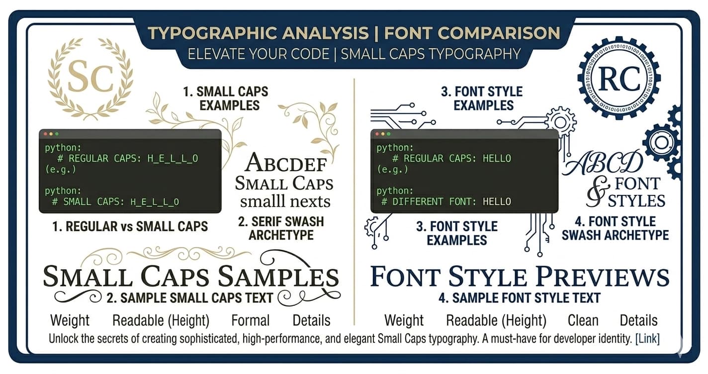
- ꜱᴍᴀʟʟ ᴄᴀᴘꜱ ᴛʏᴘᴏɢʀᴀᴘʜʏ: ꜱᴍᴀʟʟ ᴄᴀᴘꜱ ᴛʏᴘᴏɢʀᴀᴘʜʏ
The proportional relationship: in most typefaces, the x-height is roughly 70% of the cap height. True small caps are drawn at exactly this height, with their stroke weights adjusted to match the optical weight of surrounding lowercase letters.
This last detail — the stroke weight adjustment — is what distinguishes true small caps from the alternatives.
True Small Caps vs. False Small Caps
The most important distinction in small caps typography:
True small caps are drawn by the type designer as distinct letterforms. The designer scales down the proportions of capital letters to the x-height and then adjusts the stroke widths upward to compensate. A full-size capital A has thicker strokes than a lowercase 'a' would at the same height. True small caps account for this by drawing the small caps letters with proportionally heavier strokes than you'd get by simply reducing the cap size.
False small caps (also called "faux small caps") are produced by scaling down the regular capital letters mathematically — either through software or by setting them at a smaller point size. The result: visually underweight letterforms that look spindly and thin compared to the surrounding lowercase. They're technically at the right height, but they don't match the optical weight of the text.
| Feature | True Small Caps | False Small Caps |
|---|---|---|
| Stroke weight | Corrected for x-height | Too thin (not corrected) |
| Source | Separate designed letterforms in font | Mathematical reduction of capitals |
| Available in | Fonts with explicit small caps variant | Any font (via scaling) |
| Result | Visually harmonious with lowercase | Spindly, optically underweight |
| Professional quality | Yes | No |
How false small caps happen: In many design and word processing applications, selecting "small caps" in the character formatting menu applies false small caps — the application reduces the capital letters to ~70% size without accessing true small caps letterforms. True small caps are only accessible when the font file explicitly contains them (as an OpenType feature: smcp for small caps, c2sc for caps to small caps).
Professional designers test for this. If selecting "small caps" in the formatting menu produces thin, slightly-off-looking letters rather than well-proportioned ones, the font doesn't include true small caps and the application is generating false ones.
History: Small Caps in Typography
Early Printing (15th–16th Century)
The typographic tradition of small caps dates to the earliest decades of European printing. Roman punchcutters and type designers included small caps in their typefaces as a practical solution to a specific problem: how to distinguish names, abbreviations, and headings from body text without using full capitals that would visually dominate the page.
Early humanist typefaces — the Roman type styles based on Carolingian Minuscule and classical inscriptions — were designed for continuous reading in scholarly texts. Full capitals in running text created visual disruption. Small caps provided a middle solution.
By the late 16th century, small caps were a standard feature of quality typefaces. They appeared in headers, bylines, marginalia, and for the treatment of proper names and abbreviations in scholarly and legal texts.
The 18th and 19th Century: Codification
The 18th century saw small caps become a codified convention in typography manuals. John Baskerville, the Birmingham printer whose typefaces set new standards for clarity and elegance in the 1750s, used small caps extensively in the headers and display elements of his publications.
By the 19th century, small caps were sufficiently established that typography manuals described their use in specific, rule-based terms: use small caps for abbreviations in text, for the first word of a chapter or section after the initial capital, for dates, for names in certain reference formats.
The 20th Century: Type Systems
20th-century type design formalized small caps as components of complete type families. When a type house designed a new typeface, the complete package included regular, italic, bold, bold italic — and small caps variants for each. Type families like Garamond, Caslon, Palatino, Times New Roman, and Minion all include true small caps.
The transition to digital type (PostScript, then TrueType, then OpenType) initially threatened small caps. Early digital fonts often omitted them to reduce file size. As OpenType established itself in the 2000s and expanded the character set limit beyond the constraints of PostScript, small caps became a standard OpenType feature that quality typefaces include.
Professional Typography Rules for Small Caps
These are the conventions used in professional publishing, editorial design, and book typography:
1. Abbreviations in Running Text
The most consistent small caps convention: abbreviations of proper nouns, time periods, and standards organizations are set in small caps within body text.
- Incorrect: The NATO summit began at 9 AM on June 15 CE.
- Correct: The ɴᴀᴛᴏ summit began at 9 ᴀᴍ on June 15 ᴄᴇ.
Why: Full capitals for abbreviations within body text read as visual shouts — the reader's eye is pulled to the all-caps cluster, breaking reading flow. Small caps abbreviations maintain the structure of the distinction (caps signal an abbreviation) without the visual disruption.
2. Chapter and Section Openings
A classic typographic treatment for the first line or first few words of a chapter or section: set them in small caps.
Example: ꜱᴍᴀʟʟ ᴄᴀᴘꜱ ᴀʀᴇ ᴜꜱᴇᴅ ꜰᴏʀ ᴛʜᴇ ꜰɪʀꜱᴛ ʟɪɴᴇ ᴏꜰ ᴀ ᴄʜᴀᴘᴛᴇʀ — often combined with a drop cap or large initial.
This convention appears in literary fiction, non-fiction books, and academic publishing. It signals a section opening without requiring a headline-size change.
3. Running Headers and Footers
Page numbers and running headers (the title or chapter name appearing at the top or bottom of each page) are frequently set in small caps. They need to be visible but not compete with body text.
4. Names of People in Certain Reference Formats
Some scholarly citation styles, particularly in European academic publishing, set author names in small caps in bibliographies and reference lists: Smith, John. The Book Title. Publisher, 2020.
5. When NOT to Use Small Caps
- Never fake them — if you don't have true small caps, use full caps or lowercase rather than false small caps
- Not for headlines — small caps are most effective in running text contexts, not standalone headline use
- Not in digital body text — screen rendering makes the subtle weight differences in true small caps harder to perceive; small caps work best in print contexts
Unicode Small Caps: Sources and Limitations
Unicode small caps draw primarily from the Phonetic Extensions block (U+1D00–U+1D7F) and scattered characters from Latin Extended blocks. These characters were added to Unicode for the International Phonetic Alphabet — they represent specific phonetic sounds in linguistic transcription.
The coincidence: IPA characters happen to look like small caps because linguistic phoneticians historically used small caps letterforms to represent certain sounds in phonetic notation.
The Unicode Small Caps Alphabet
ᴀ ʙ ᴄ ᴅ ᴇ ꜰ ɢ ʜ ɪ ᴊ ᴋ ʟ ᴍ ɴ ᴏ ᴘ ǫ ʀ — ᴛ ᴜ ᴠ ᴡ — ʏ ᴢ
Gaps and approximations:
- Q: ǫ (U+01EB) is used — a 'q' with ogonek, not a true small caps Q
- R: ʀ (U+0280) — the IPA character for a uvular trill, but visually reads as small caps R
- S: No widely supported small caps S in Unicode — regular lowercase 's' is often used as an approximation
- X: No small caps X — regular lowercase 'x' used
- Z: ᴢ (U+1D22) — exists in some font implementations
The result is close but not complete. For social media use, the overall impression reads clearly as small caps. For professional print typography, Unicode small caps are not a substitute for proper font small caps — the gaps and approximations would be visible and unacceptable.
Platform Rendering
Unicode small caps characters come from the Basic Multilingual Plane (U+0000–U+FFFF), which has excellent support across all modern systems — better, in fact, than the Mathematical Alphanumeric Symbols block (which requires Supplementary Multilingual Plane support). Unicode small caps render correctly on all modern platforms and the vast majority of older devices as well.
Small Caps for Social Media: Platform Guide
Small caps is the Unicode style most appropriate for LinkedIn's professional context. It creates visual structure without decorative flair — the right register for professional identity.
Headline uses:
ꜱᴇɴɪᴏʀ ᴘʀᴏᴅᴜᴄᴛ ᴅᴇꜱɪɢɴᴇʀ · UX Research · Design Systems | Open to Opportunities
The small caps role title creates visual weight without the aggressive tone of all-caps.
About section structure: Using small caps section headers in the LinkedIn About section creates editorial-quality visual hierarchy in a plain-text field:
ᴀʙᴏᴜᴛ
ᴇxᴘᴇʀᴛɪꜱᴇ
ʀᴇᴄᴇɴᴛ ᴡᴏʀᴋ
This approach gives the About section the structure of a designed document without any formatting tools.
Instagram and TikTok: Minimalist Profiles
For photographers, architects, illustrators, writers, and anyone whose brand is built on refined aesthetics, small caps in bios signals taste:
ᴘʜᴏᴛᴏɢʀᴀᴘʜᴇʀ · ᴍɪʟᴀɴ
Compared to bold cursive or Gothic, small caps reads as the most restrained and intentional choice — appropriate for profiles where excess would undermine the brand.
Twitter/X Display Names
Small caps display names on Twitter have a particular quality: calm, deliberate authority. In a medium where many display names use exclamation marks, emoji stacks, or highly decorative Unicode, a small caps name signals confidence through understatement.
ᴊᴀᴍᴇꜱ ᴍᴀʀꜱᴛᴏɴ reads differently than James Marston — slightly more formal, slightly more considered.
Discord
Small caps on Discord stands out against the more common Gothic and Bold Cursive styles that dominate most servers. For servers in academic, creative, professional, or literary contexts, small caps display names carry the right aesthetic weight.
Small Caps vs. Similar Unicode Styles
| Style | Visual Register | Best Contexts |
|---|---|---|
| ꜱᴍᴀʟʟ ᴄᴀᴘꜱ | Refined, editorial, quiet authority | LinkedIn, minimalist Instagram, academic Discord |
| 𝒞𝓊𝓇𝓈𝒾𝓋𝑒 | Romantic, flowing, expressive | Lifestyle Instagram, beauty TikTok |
| 𝔊𝔬𝔱𝔥𝔦𝔠 | Dramatic, countercultural, heritage | Music Discord, dark aesthetic, streetwear |
| 𝐁𝐨𝐥𝐝 | Strong, direct, clear hierarchy | Professional emphasis, announcements |
| ᴠᴀᴘᴏʀᴡᴀᴠᴇ | Retro, ironic, aesthetic | Vaporwave accounts, retro digital |
Small caps occupies a unique position: it's the most typographically sophisticated choice without being visually dramatic. It signals that the user knows about typography — not just that they have access to a text generator.
This is why it performs well on platforms (LinkedIn) and for audiences (editors, designers, academics) who will recognize the typographic reference and appreciate the restraint.
The Paradox of Subtle Distinctiveness
Small caps illustrates an interesting principle of profile typography: sometimes the most distinctive choice is the most restrained one.
On a platform where every other styled text is either Vaporwave, Bold Cursive, Gothic, or Bubble, a small caps display name is unusual precisely because it's quiet. It's the typography equivalent of speaking in a measured tone at a loud party — you stand out because you're not shouting.
For creators and professionals whose brand is built on quality, taste, and expertise rather than volume and spectacle, small caps is the rare Unicode style that communicates those values through typographic restraint.
Generate Small Caps Text
Unicode small caps for Instagram bios, LinkedIn headlines, TikTok display names, Twitter profiles, and Discord display names at Lettertype's Small Caps Generator.
The full range of professional Unicode styles — Small Caps, Bold, Italic, and more — is available in Lettertype's full generator.