Italic Fonts — The Complete History from Venice 1501 to Digital Typography
Italics are so woven into typography that most people don't think of them as a distinct invention. They seem like an obvious, inevitable feature of written language — a tilted version of upright type, used for emphasis and titles.
But italic type was invented at a specific moment in history, by specific people, for a specific commercial reason. The story is more interesting than the default assumption suggests, and understanding it changes how you see every slanted letter.
Before Italic Type: The Chancery Hand
Italic type didn't emerge from nothing. It was based on an existing calligraphic tradition: the Cancellaresca corsiva, or Chancery Cursive.
The Papal Chanceries of 15th-century Rome and Florence developed a distinctive writing style for official documents. Humanist scholars and scribes needed a hand that was:
- Faster to write than formal book scripts
- More elegant than everyday informal writing
- Legible at speed by trained readers
The result was the Chancery hand — slightly compressed, slightly slanted, with connected letterforms that allowed faster writing without sacrificing the elegance expected of official documents. It was essentially cursive writing elevated to the level of calligraphic art.
This style spread throughout educated Europe. Renaissance humanists — the scholars who were rediscovering classical texts and establishing the intellectual culture of the Italian Renaissance — adopted the Chancery hand as the preferred writing style for educated correspondence. It signaled membership in the humanist scholarly community.
When printers began looking for typeface models that would appeal to humanist readers, the Chancery hand was the obvious reference. It was what the educated audience already wrote and read in manuscript form.
Aldus Manutius and the Invention of the Italic Typeface
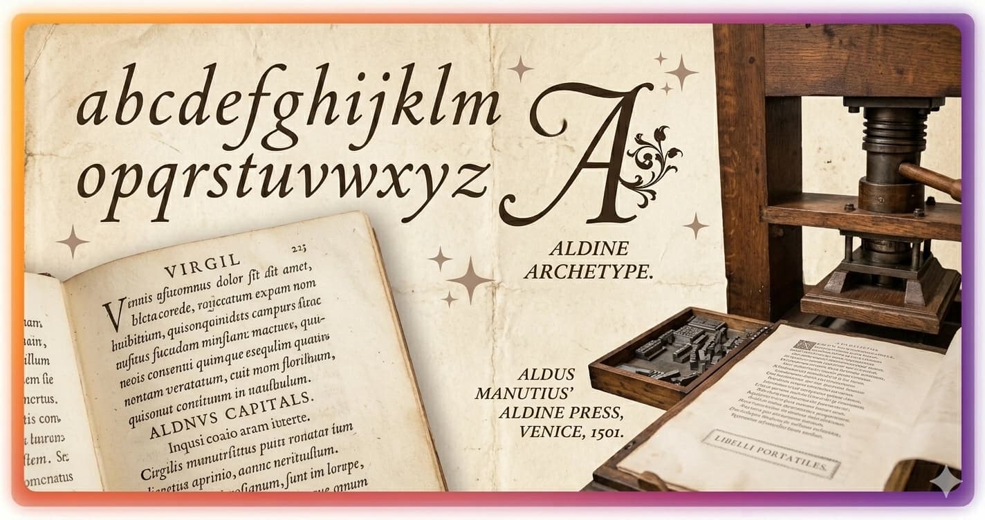
Aldus Manutius (1449–1515) was a Venetian printer who fundamentally changed what books could be. His Aldine Press, founded in Venice in 1494, was distinguished by an ambition that went beyond most contemporary printers: he wanted to produce affordable, pocket-sized editions of classical Greek and Latin texts, accessible to scholars who couldn't afford expensive large-format editions.
The challenge was economic. Large-format books required expensive paper and took longer to set and print. To make affordable pocket editions, Manutius needed to pack more text per page than standard Roman type allowed.
His solution: commission a new typeface based on the Chancery hand.
In 1500–1501, Manutius commissioned Francesco Griffo — a punchcutter from Bologna who had already cut several Roman typefaces for the Aldine Press — to design and cut the first italic typeface. Griffo's design was based on the Chancery cursive, with characteristics that distinguished it from both Roman type and manuscript originals:
- Slightly compressed letterforms (narrower than Roman type, fitting more characters per line)
- A consistent rightward slant of approximately 5–10 degrees
- Ligatures connecting letter pairs common in handwriting
- Capitals that remained upright rather than slanting with the lowercase
The first book printed in the new italic type was a small-format edition of Virgil's works, published by the Aldine Press in April 1501. The Aldine Italic — sometimes called the Venice Italic — was an immediate success.
What the First Italic Was Actually For
A common misconception: early italic type was used for emphasis, the way we use it today.
It wasn't.
The Aldine Italic of 1501 was used as a display face — an entire text font used for the body of pocket editions. The Virgil edition was set entirely in italic. The entire text was slanted, not selected words or phrases.
Italic type functioned as a complete typeface in its own right — not a variant of Roman type, but a distinct style derived from a different calligraphic tradition. Early readers would have understood it as a different font, not a modification of an existing one.
The modern use of italic for emphasis within Roman text — which seems so obvious and natural to us — developed later, as italic and Roman type began to be used together in the same publications. Printers discovered that the visual contrast between upright Roman and slanted italic could be used to signal distinctions: titles within running text, foreign words, glosses, quotations.
By the mid-16th century, the mixed Roman-italic system was established. But this was an emergent convention, not what Aldus Manutius had in mind in 1501.
The Priority Dispute: Griffo vs. Manutius
Francesco Griffo's contribution to typography is one of the more contested questions in the field.
The conventional account attributes the Aldine typefaces — including the italic — to Manutius as their commissioner and intellectual driver. But Griffo, who cut the actual punches (the steel dies from which type is cast), claimed he deserved the primary credit for the designs.
The relationship deteriorated. Griffo eventually left the Aldine Press, and Manutius's exclusive use of italic type — which he had trademarked with the Venetian Senate — was soon breached by other printers who cut their own italic types based on Griffo's design.
The bitter irony: Griffo's design was so successful that it was immediately copied throughout Europe, making the Aldine Press's commercial advantage short-lived. Within a decade of the 1501 Virgil, numerous Italian and French printers had their own italic types — most derived from or inspired by Griffo's original.
The Spread of Italic Through Europe
1503: Printers in Florence and Rome were already producing unauthorized italic types based on the Aldine design.
1520s: French type designers, including Simon de Colines and Robert Estienne, adapted italic for the French market. French italic types were generally lighter and more refined than the early Italian models.
1540s: Claude Garamond cut what became the defining italic of the 16th century — the Garamond Italic, used in Paris by Robert Estienne. Garamond's italic was more carefully coordinated with the accompanying Roman type than earlier italics, establishing the precedent for italic and Roman as a matched pair.
Late 16th century: The Chancery tradition continued through printed writing manuals. Arrighi (Ludovico degli Arrighi), a professional scribe who became a printer, published instruction books on the Chancery hand that influenced italic type design throughout the century.
17th century: Italic types became standardized across European printing. The slant angle settled around 8–15 degrees. Capitals became more consistently slanted to match lowercase.
True Italic vs. Slanted Roman (Oblique)
This distinction matters: not all "italics" are created equal.
True italic is a typeface designed from scratch as an italic — different letterforms, not just slanted versions of the upright characters. A true italic lowercase 'a' looks different from the Roman lowercase 'a': the Roman 'a' has two stories (the bowl and the counter above it), while the italic 'a' typically has one story (derived from the Chancery hand). The italic 'f' often descends below the baseline. The italic letters have their own distinct proportions and design logic.
Oblique (or false italic, or slanted Roman) is simply the Roman letterforms mathematically tilted. The letterforms are the same; only the angle changes. The 'a' is still a two-story Roman 'a', just tilted.
| Feature | True Italic | Oblique / Slanted Roman |
|---|---|---|
| 'a' form | Single-story, Chancery-derived | Double-story Roman, just tilted |
| 'f' | Often with descender | Roman 'f', tilted |
| Letter proportions | Different from Roman | Identical to Roman, tilted |
| Origin | Designed independently | Mathematical transformation |
| Visual quality | More distinct contrast with Roman | Less distinct, slightly awkward |
| Examples | Garamond Italic, Times New Roman Italic | Many sans-serif italics, Helvetica Oblique |
Many sans-serif type families use oblique rather than true italic. Helvetica Neue Italic, for example, is mathematically slanted Helvetica, not a redesigned italic. This is why the italic feels slightly forced compared to serif italics like Garamond.
Some type designers and typographers consider oblique inferior. Others argue that for geometric sans-serif typefaces, the Chancery-derived forms of true italic would be stylistically inconsistent, making oblique the appropriate choice.
The 19th and 20th Century: Italic Revivals and Modernism
Private Press Revival
The Arts and Crafts movement of the late 19th century — and the private press movement it inspired — looked to historical type models as alternatives to the industrialized printing of the period.
Emery Walker, William Morris (Kelmscott Press), and later T.J. Cobden-Sanderson (Doves Press) drew on Aldine and Garamond models for their revival typefaces. The Chancery tradition was rediscovered and admired as a counter to Victorian excess.
20th Century Type Design
Stanley Morison at Monotype supervised the design of Times New Roman (1931), which includes a true italic designed by Victor Lardent based on historical models. Times New Roman's italic became perhaps the most widely seen italic in the history of printing.
Hermann Zapf designed Palatino (1949) and the accompanying Palatino Italic — both with deep connections to Chancery calligraphy. Zapf was himself a calligrapher, and his type designs show it: the Palatino italic has a flowing quality that comes from direct understanding of the pen dynamics behind the letterforms.
Jan van Krimpen at Enschedé designed Cancelleresca Bastarda (1930s), an italic type explicitly named for the Chancery tradition, and Romanée with its matching italic — both considered among the finest 20th-century designs in the tradition.
Digital Italic Type
The transition to digital type (PostScript, TrueType, OpenType) changed how italics are distributed and used.
Font Families and Style Linking
Modern digital type packages italic as a separate font file within a type family — Regular, Italic, Bold, Bold Italic are typically four separate files that the operating system links together so applications can request italic or bold versions of a typeface.
When a user presses Ctrl+I in a word processor, the application requests the italic variant of the current typeface. If the font family includes a true italic, the italic file is loaded. If the family only includes a regular weight, the application mathematically slants the regular — producing pseudo-italic (oblique) that the type designer never intended.
This is why italicizing a typeface that has no italic variant — especially a display or script font — often looks wrong. The application is creating an oblique that doesn't match the font's design intent.
Variable Fonts
OpenType Variable Fonts (2016) introduced a new model: a single font file with an axis that interpolates between multiple instances. Some variable fonts include a slant axis that can produce any degree of tilt from 0 to 15 degrees. More sophisticated variable fonts include a separate italic axis that actually switches to a distinct italic design at a certain point on the axis.
This opens possibilities that traditional separate-file italic couldn't achieve: transitional states between Roman and italic, or precise slant control for display use cases.
Unicode Italic Text
The Unicode Mathematical Alphanumeric Symbols block (U+1D434–U+1D467) includes a full Mathematical Italic alphabet.
These characters were designed for mathematical notation — the convention of using italic for scalar variables in equations. In a typeset equation like f(x) = x², the variables f and x are in mathematical italic; the function notation f(x) is in Roman (upright).
Unicode Mathematical Italic encodes this convention: each italic character has a distinct code point from its Roman equivalent. This means an equation written in plain Unicode text — without any font or formatting — can correctly distinguish roman and italic mathematically.
The aesthetic use of Unicode italic on social media is borrowing this technical convention for expressive purposes. "𝐼𝑡𝑎𝑙𝑖𝑐 𝑡𝑒𝑥𝑡 𝑖𝑛 𝑎 𝑏𝑖𝑜" uses Mathematical Italic characters that were designed for physics papers, but they work in bios precisely because they're Unicode — they render on every modern device without any font file.
The limitation: Unicode Mathematical Italic looks like a serif italic (specifically, it resembles Computer Modern Italic, the font used in TeX). On platforms that render with certain system fonts, it may look slightly different from the "italic" you'd produce with a word processor. But it's consistently readable as italic across platforms.
Italic in Contemporary Typography
Italic today functions in several distinct roles:
Emphasis within running text: The most common use. A word in italic draws the reader's attention without the visual weight of bold. Editorial style guides (Chicago Manual of Style, AP) specify when italic is appropriate (titles of works, foreign words, technical terms, emphasis).
Display type: Italic as a standalone display face — entire headlines or titles set in italic — signals movement, energy, and modernity. Many editorial designs use italic display type as a signature element.
Brand identity: Companies like Italic (the membership fashion company), and numerous luxury brands, use italic letterforms in their wordmarks to signal elegance, speed, and dynamism.
Script simulation: In the absence of actual script or cursive typefaces, italic provides a handwriting-adjacent quality. Greeting card and lifestyle brand typography often uses italic to approximate the warmth of handwriting without the legibility challenges of full cursive.
Generate Italic Unicode Text
Unicode Mathematical Italic text — usable in Instagram bios, Discord display names, TikTok captions, Twitter profiles, and anywhere that accepts Unicode — is available at Lettertype's Italic Generator.
The full range of italic variants — Italic, Bold Italic, and more — is available in Lettertype's full generator.