Fraktur — The History of Blackletter from Medieval Manuscripts to Modern Tattoos
The letterforms you see on the New York Times masthead, on Supreme hoodies, on heavy metal albums, and in tattoo studios across the world share a common origin: medieval European scriptoria, where monks with quill pens developed a dense, angular handwriting style that would shape typography for centuries.
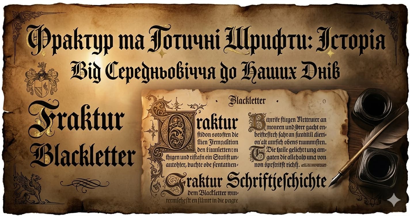
Fraktur — the German name for the family of typefaces more broadly called Blackletter or Gothic — has survived religious wars, the printing press, the Nazi regime, punk culture, and the internet. No other typeface family carries as much historical and cultural weight per letterform.
What Makes Blackletter Distinctive
Blackletter is defined by the broken stroke — angular, dark, textured letterforms that prioritize density over the open, rounded forms of Roman type. Where a Roman capital O is essentially a circle, a Blackletter capital O is constructed from angular strokes that meet at sharp points.
The three primary Blackletter styles that developed historically:
Textura (or Textualis) — the oldest style, dominant in the 12th–15th centuries. Dense, upright, highly compressed. Used for liturgical texts, formal documents, and Gutenberg's Bible. The name references the "woven" appearance of text blocks on the page.
Schwabacher — a slightly more rounded, accessible variant that emerged in 15th-century Germany. More common in everyday use than Textura.
Fraktur proper — the most refined and standardized of the German Blackletter styles. Developed in the 16th century under imperial patronage, it remained dominant in German-speaking regions for nearly 400 years.
A Timeline of Blackletter
| Date | Event |
|---|---|
| 12th century | Gothic/Blackletter script emerges in France as manuscripts become denser |
| Late 12th century | Becomes dominant writing style across Western Europe |
| ~1450s | Gutenberg uses Textura (Blackletter) type for his Bible — the first major printed book |
| 1513 | Emperor Maximilian I commissions Fraktur types from Augsburg printer Johann Schönsperger for his Prayer Book (Gebetbuch) |
| 1517 | Theuerdank, Maximilian's illustrated epic poem, published in Fraktur — accelerates mainstream adoption |
| 16th century | Italy develops Humanist (Roman) type; rest of Europe adopts it. Germany retains Blackletter |
| 17th–18th century | Antiqua–Fraktur dispute intensifies: Roman vs. Blackletter as nationalist debate in German culture |
| 19th century | Arts and Crafts movement revives Blackletter as symbol of medieval craftsmanship |
| 1933 | Nazi Party adopts Fraktur as the "German" typeface; state documents use it officially |
| January 3, 1941 | Bormann circular bans Fraktur from all official use; declares it "Judenlettern" |
| Post-WWII | Blackletter associated with Nazi Germany; largely avoided in German design for decades |
| 1960s–70s | Counterculture adopts Blackletter: rock, then metal, then punk |
| 1980s–present | Heavy metal bands, tattoo culture, streetwear brands use Blackletter continuously |
| 2023–present | Fresh resurgence in editorial design, fashion, and branding |
Gutenberg and the First Printed Blackletter
Johann Gutenberg's printing press, developed in the 1440s and producing the famous Gutenberg Bible by the mid-1450s, used Textura — the dense Gothic script that dominated European manuscript culture at the time.
This was not an aesthetic choice so much as a practical one: Gutenberg was creating a technology designed to replicate existing handwritten books. The type he cut was designed to look like the scribal hands readers already knew. Blackletter was not chosen for the first major printed book because it was beautiful (though it was); it was chosen because it was familiar.
The consequence is significant: Blackletter is the foundational typeface of print. Every printed book, every printed document in the history of the medium begins, in some sense, with Gutenberg's Textura type.
Imperial Fraktur: When Maximilian I Made It Official
The transition from general Blackletter to Fraktur specifically happened under imperial patronage.
In 1513, Holy Roman Emperor Maximilian I commissioned a new typeface for his personal Prayer Book (Gebetbuch). The printer Johann Schönsperger in Augsburg produced the first types that would be classified as Fraktur proper — more refined than Schwabacher, more systematized than earlier Textura variants.
Four years later, in 1517, Maximilian's illustrated epic poem Theuerdank was published using this new Fraktur. The poem was a prestige publication, widely distributed and highly visible — it functioned as propaganda for the imperial legacy. The Fraktur typeface, used for an emperor's vanity project, became associated with German identity and authority at the highest level.
This association between Fraktur and German imperial prestige would shape the next four centuries of typographic politics in the German-speaking world.
The Antiqua–Fraktur Dispute: Four Centuries of Font Politics
The longest-running typographic controversy in history is not a recent culture-war debate. It's the Antiqua–Fraktur dispute: the centuries-long argument in German-speaking countries about whether Roman (Antiqua) or Blackletter (Fraktur) should be the national script.
The dispute began in the 16th century as Humanist (Roman) typefaces spread from Italy across Europe. Germany largely resisted this shift. Fraktur was increasingly identified as the authentically German letterform — a script that set German culture apart from Roman influences.
By the 19th century, the debate had taken on explicit nationalist dimensions. Advocates for Fraktur argued it was uniquely suited to the German language; advocates for Antiqua argued it was incomprehensible to non-Germans and isolated German scholarship from international exchange.
The debate produced its most ironic chapter in the 20th century.
The Nazi Fraktur Paradox: 1941
The relationship between the Nazi regime and Fraktur is one of the more historically bizarre episodes in typography.
The Adoption
When the Nazi Party came to power in 1933, they embraced Fraktur as the authentic German script. State documents, party literature, and official publications used Fraktur. It was positioned as the typeface of the German Volk — racially and culturally pure, opposed to the "cosmopolitan" Roman letterforms of international typography.
The Ban
On January 3, 1941, Martin Bormann issued a circular to all Nazi officials declaring Fraktur banned from German public and official life.
The stated reason was extraordinary: Bormann declared that Fraktur was actually "Judenlettern" — Jewish letters. He claimed that the typeface had been developed by Jewish printers and calligraphers, and that it was therefore inappropriate as the national German script.
The circular itself was typeset in Fraktur.
The Real Reason
Historians have reached a fairly clear consensus on the actual motivation. By 1941, Germany occupied much of Europe and was running a massive propaganda operation across occupied territories from France to Norway to Poland. Fraktur — which had been specifically the German typeface — was nearly impossible to read for anyone who had not grown up with it. French readers couldn't read it. Dutch readers couldn't read it. Even many younger Germans preferred Roman type.
The practical logistics of occupation and propaganda required a typeface that could be printed and read across all of occupied Europe. Roman type was the obvious solution.
The "Jewish letters" justification was political cover for a pragmatic decision — a way to ban a typeface that had been positioned as the pinnacle of German racial identity without admitting that it was simply too German to work in the new European empire.
The Irony
The Nazi regime spent eight years declaring Fraktur the authentic German typeface, used it to signal nationalist identity, and then banned it — blaming Jewish influence for a font they had just finished celebrating as the pinnacle of Aryan culture.
It remains one of the more striking examples of political typography in modern history.
Post-War Blackletter: The Counterculture Reclamation
After World War II, Fraktur and Blackletter were largely avoided in German design. The associations with National Socialism were too fresh. German typography moved heavily toward Swiss-influenced modernism and International Style.
Outside Germany, the story was different. Blackletter had never carried the same Nazi associations in English-speaking countries, where it was associated with historical authority (newspaper mastheads, diplomas, church signage) and medieval romance rather than 20th-century politics.
The counterculture reclamation of Blackletter began in earnest in the late 1960s and accelerated through the 1970s:
Rock music — album art and concert posters for psychedelic and hard rock bands began using Blackletter as a way to signal weight, darkness, and countercultural authority.
Heavy metal — from the late 1970s onward, Blackletter became the dominant typeface of metal culture. Band names, album covers, merchandise — Gothic and Fraktur letterforms define the visual language of the genre. Metallica, Black Sabbath, and hundreds of other bands used Blackletter as shorthand for the music's darkness and power.
Punk — adopted Blackletter with ironic distance, using the institutional authority of the letterform in contexts explicitly opposed to institutions.
Tattoo culture — Blackletter became and remains one of the most popular tattoo styles globally, particularly for text. The heavy, consistent strokes of Fraktur age better than most font categories (thin strokes blur as ink migrates; Blackletter has relatively few thin strokes).
Newspaper Mastheads: Institutional Authority in Type
The most visible use of Blackletter in everyday contemporary life is newspaper mastheads — the publication name at the top of the front page.
| Newspaper | Masthead Style | Notes |
|---|---|---|
| New York Times | Engravers' Old English BT | In continuous use since 1851; redesigned 1967 by Edward Benguiat |
| Daily Telegraph | Stylized Blackletter | British authority signaling |
| Los Angeles Times | Blackletter-influenced | West Coast institutional authority |
| The Guardian | Modern sans-serif | Moved away from Blackletter in 2018 redesign |
The New York Times masthead is the most recognizable Blackletter in contemporary American visual culture. Its Engravers' Old English BT has been the masthead since the paper's founding in 1851 — and has been retained through every redesign since, including a significant update by type designer Edward Benguiat in 1967 that thinned the strokes and adjusted spacing while preserving the fundamental character.
Why do newspapers keep Blackletter mastheads? The same reason they've always used them: the letterforms signal authority, permanence, and institutional legitimacy in a way no sans-serif can replicate. Even readers who couldn't name the typeface or explain its history respond to what it communicates.
Streetwear and the Chicano Connection
The contemporary streetwear adoption of Blackletter runs through a specific cultural lineage.
In 1940s–1970s Los Angeles, Chicano communities developed a distinctive lettering tradition influenced by Old English calligraphy — used in lowrider culture, gang affiliations, and community art. This tradition drew directly from the historical authority of Blackletter, recontextualizing institutional type within working-class community identity.
That Chicano lettering tradition directly influenced early 1990s and 2000s streetwear in Los Angeles. Brands operating in and around that cultural moment picked up Blackletter as a way to signal street credibility and community belonging. Supreme's use of Blackletter in box logo variations, and numerous other brands' use of Old English type in their graphics, flows from this lineage.
The cultural chain: medieval German monastery → imperial typographer → newspaper mastheads → rock and metal → tattoo culture → Chicano lettering tradition → LA streetwear → global fashion → TikTok and Discord aesthetics.
Fraktur Unicode Characters
The Fraktur and Gothic characters available in Unicode come from the Mathematical Fraktur blocks — included in the Unicode standard because Fraktur letterforms are used in mathematical notation (physics, set theory, abstract algebra).
Mathematical Fraktur Uppercase: 𝔄 𝔅 ℭ 𝔇 𝔈 𝔉 𝔊 ℌ ℑ 𝔍 𝔎 𝔏 𝔐 𝔑 𝔒 𝔓 𝔔 ℜ 𝔖 𝔗 𝔘 𝔙 𝔚 𝔛 𝔜 ℨ
Mathematical Fraktur Lowercase: 𝔞 𝔟 𝔠 𝔡 𝔢 𝔣 𝔤 𝔥 𝔦 𝔧 𝔨 𝔩 𝔪 𝔫 𝔬 𝔭 𝔮 𝔯 𝔰 𝔱 𝔲 𝔳 𝔴 𝔵 𝔶 𝔷
Note: Several uppercase letters (C, H, I, R, Z) are encoded in the Letterlike Symbols block rather than Mathematical Fraktur — ℭ (C), ℌ (H), ℑ (I), ℜ (R), ℨ (Z) — because they were already established as mathematical symbols before the Mathematical Alphanumeric block was created.
Why Blackletter Has Never Really Left
Every generation since the 12th century has found a use for Blackletter. The reasons shift — religious authority, imperial prestige, national identity, countercultural rebellion, tattoo aesthetics, streetwear credibility, Discord server identity — but the letterforms persist.
The explanation is partly historical weight (no typeface family carries more loaded associations per character), partly aesthetic distinctiveness (Blackletter looks unlike everything else), and partly technical durability (the heavy strokes work well in contexts where thin strokes fail — stone carving, screen embroidery, skin).
Gothic Unicode fonts bring this 900-year tradition into copy-paste format, available for any Discord display name, Instagram bio, or TikTok caption. The cultural chain between a 12th-century French scriptorium and a 2026 TikTok bio is direct and traceable, if improbable.
Use Gothic / Blackletter Text
Generate Fraktur and Gothic Unicode text for any platform at Lettertype's Gothic Generator. Copy-paste into Discord display names, Instagram bios, Twitter profiles, or anywhere Unicode is supported.